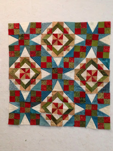
Help! Bonnie revealed the arrangement of Celtic Solstice and it is great. But others on a FB group came up with a minor adjustment to the arrangement that I also love. So I am asking you, dear blog readers, to offer your opinion. There is no right or wrong answer and I really don't know which way to go. But here is a little info to help your decision. I used a Christmas fabric as my focus but will not be using it as a border. At least I don't think so as the reveal included a pieced border and the pieces are already put together and I really don't need to make it bigger. This is only a small portion with only 9 blocks shown. The final quilt will have 49 blocks. I am hoping that it will be a quilt that I can pull out at Christmas but that is not just a Christmas quilt. So here goes.
Number 1
Or Number 2
I really hope you will take the time to comment on this one. I would love to see what you think. Thanks


30 comments:
Love your choice of colours, I like both layouts, but if I had to choose then option 2!
Love them both! Your colors rock! I like #2 personally. As everyone has been telling me about my quilt blocks...you are the only one who has to be happy with it. Be sure to let us know the final tally of votes from your followers! You can always send it to me if it becomes too much of a hassle for you! Cheery Wave from Bev
I love your color choices, too. Since it is Christmas fabric, I like #2 better... the blocks look like lights or stars. Choice 1 is nice, but choice 2 sparkles.
I would choose option #2 It just seems to have more personality! Either one would be beautiful with your choice of fabrics. Great job.
I like #2 better. It has more sparkle, but keeps the illusion of curves.
I too am doing Celtic Soltice and am amazed at the difference in the two. I love, love, love the pattern but am partial to the stars in No. 2. But then they are very popular right now. Just a fun, fun design.
It's going to be beautiful!! I like the #2 layout the best, but they are both wonderful.
Number two. Why? Because it has a lighter, airier feel to it. Number one looks heavier. Make sense?
I like number 2 as well
Wow they both look so great! I like option 2 slightly better. What a great mystery quilt!
Love both versions, but like the others, I like the stars in #2. Good Luck!
It has beena great mystery...one year I will join in! I like them both but the stars are winners for me too :-)
My first instinct is 2, but it might be your colors. I'm going to have to make more blocks and decide, but you may be on to something. How fun!!
#2 is my pick.
A beautiful quilt...number two has more light and sparkle, it is gorgeous!
Wow - isn't it dramatic!! Great to see the two layouts - and I do prefer the second but it must be your personal choice. Have fun with it.
Hilda
I think I might be on my own here but I prefer number 1 because it has a simpler feel. Number 2 is very busy but is probably more Christmassy.
Both are winners on my opinion. But I like 2 a little better. I hope you have fun deciding on your favorite. Maybe you could make another one:D
loving number 2! Awesome color choices.
# 2 is my favorite, really nice!
Block 1 looks like it has a peppermint candy in the middle. Block 2 looks more like a star. They both keep the main element going through the nine patch area. What a fun problem to have!! I vote for #2.
Hmmm.... I looked at both and immediately thought: #2. Then I went to the kitchen for some fortification, came back and thought: definitely #1. :) #1 seems more "classic" or somehow calmer. #2 is nice though too. Either version will be great--maybe with more blocks to look at your decision will be easier? Good luck!
The stars are wowing me in choice 2.
Number #2 for sure
Both are great but the star version might be more suited to a quilt used around Christmas time.
Wow! That is Beautiful! I like the first picture but then I saw the second pictures and thought I liked this more. In the second setting you can see the stars and if it's to be a Christmas quilt I'd go with the second setting. I love the border print with it. It's lovely!
You made the right decision going with the second layout. They both look really good, but the second just has a little more pizazz.
Oh my, I really love your adjustment to the Celtic Solstice. The squares on point are the only thing I don't really liked... Would you mind if I copy your stars idea?
I also vote for 2. I have seen one or two who chose to use both block versions in alternate rows. Also, very pretty.
Post a Comment